Decorative Flowers IV
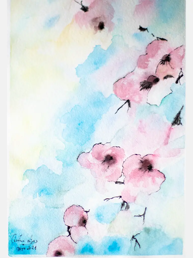
This work is part of our series dedicated to flowers, a collection that seeks to capture the essence of nature from a unique perspective. In this piece, an array of pink flowers stands out softly against a blue background, creating a serene and balanced atmosphere.
The process of creation began with an in-depth study of pink flowers, observing their delicacy and the variety of tones that this colour offers. The artist was drawn to the softness of pink, which symbolises tenderness, love and hope. In choosing these flowers, she sought to convey the calm and peace that this colour can inspire, while exploring how it interacts with the blue background, which in turn evokes serenity and reflection.
The work was created using a mixed technique combining oil and watercolour, which allows for a smooth and harmonious transition between the shades of pink and blue. The blue background, chosen for its ability to highlight the flowers without detracting from their prominence, creates a contrast that enhances the subtle beauty of each petal. The texture of the brushstrokes also plays an important role, adding a touch of depth and movement to the piece, inviting the viewer to immerse themselves in the calm that emanates from this combination of colours.
The contrast between the pink flowers and the blue background is not only visual, but also emotional. While the flowers convey a sense of lightness and sweetness, the blue of the background invites reflection and introspection, creating a space in which both tranquillity and the energy contained in nature meet.
In observing this work, the viewer is invited to explore the connection between the colours, to appreciate the softness of the flowers and to reflect on the harmony found in the simplicity of nature. Each pink flower is a small expression of beauty, a pause amidst the dynamism of the world.
This painting is a tribute to serenity and elegance, an invitation to stop and admire the small wonders that surround us.
Decorative Flowers III
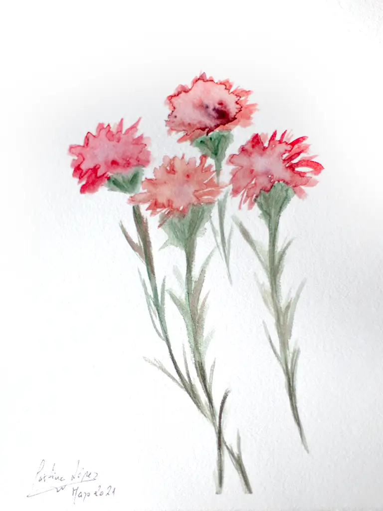
This work is part of our series dedicated to flowers, a collection that seeks to explore and capture the essence of nature through art. In this particular piece, a bouquet of four red flowers becomes the protagonist, highlighting the intensity and passion that this colour evokes.
The process of creation began with an in-depth observation of the red flowers in their natural environment. The artist was inspired by the vibrant energy of these tones, which symbolise love, strength and vitality. The choice of red flowers is not only due to their external beauty, but also to the feelings and emotions they arouse: red as a colour that burns, that awakens, that makes itself felt.
The painting was made with a mixed technique combining oil and watercolour details. This fusion of materials allows us to capture the richness of the colour red in its various shades, creating a contrast between the intensity of the flowers and the softness of their contours. Each brushstroke was designed to highlight the structure and delicate curves of the petals, seeking to convey the energy of the flower, as well as the serenity it can bring to the viewer.
The inspiration behind the work also comes from the contrast that red flowers can offer in nature. They are flowers that often attract attention with their bright, vibrant colour, but at the same time hide an inner fragility. Thus, in this painting, each red flower reflects both the strength and vulnerability that coexist in the same being.
By observing this piece, the viewer is invited to connect with the dynamism and energy of the colour red, to reflect on its symbolic power and to admire the beauty of what may often seem simple, but is full of nuances and deep meanings.
This bouquet of red flowers is a tribute to life, passion and the constant transformation that defines nature.
Decorative Flowers II
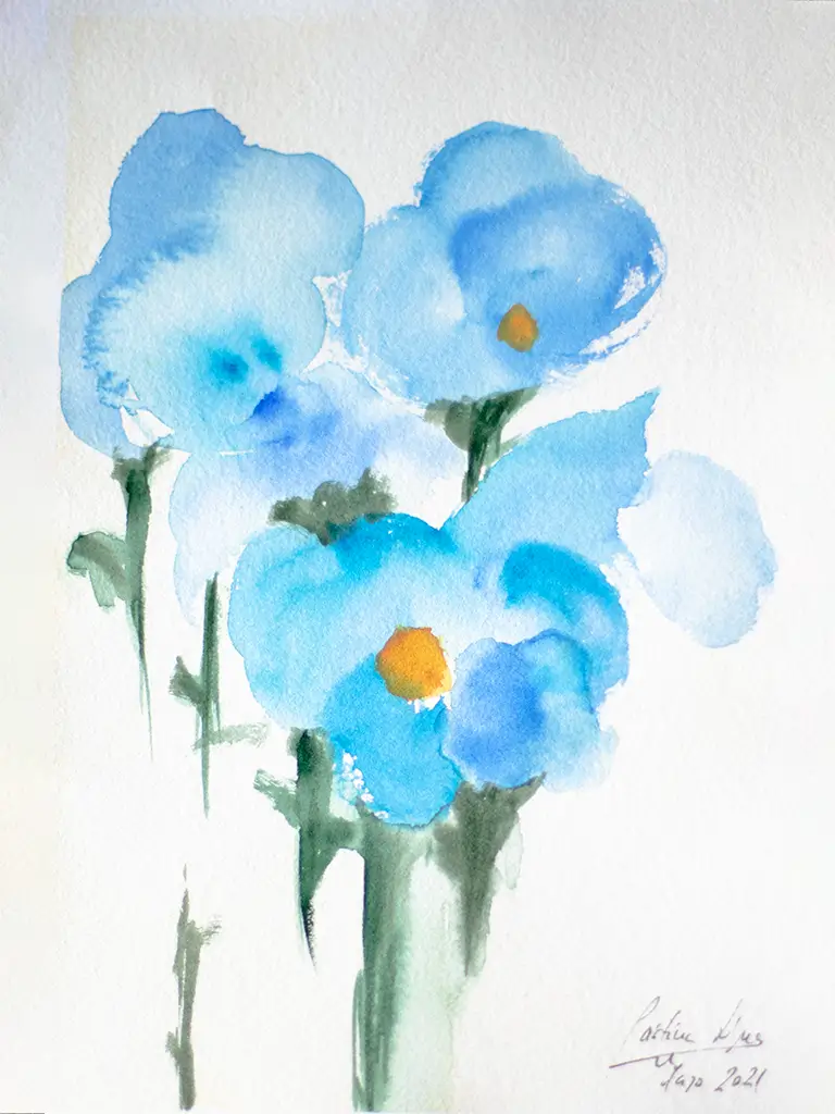
The process of creating this piece began with a visual exploration of natural flowers, a detailed study of their shapes, textures and colours. The artist immersed herself in a world of silent gardens, where flowers were the centre of her attention. The choice of blue flowers was not accidental: this colour symbolises tranquillity, serenity and reflection. Throughout the work, each brushstroke seeks to convey not only the external beauty of the flowers, but also the emotion they arouse in those who observe them.
The work was created through a careful mixed technique, combining the use of oil with details in watercolour, which allows a softness in the transition of tones and a richness in the nuances. This mixture of media seeks to represent the duality of the ephemeral and the eternal that resides in each petal: a fleeting moment that is captured in the painting.
The work was created through a careful mixed technique, combining the use of oil with details in watercolour, which allows for a softness in the transition of tones and a richness of nuances. This mixture of media seeks to represent the duality of the ephemeral and the eternal that resides in each petal: a fleeting moment that is captured in the painting.
Throughout the process, the artist let herself be carried away by the inspiration of the moment, without losing the connection with nature. The bouquet of blue flowers is therefore a reflection of both precise observation and a subjective interpretation of life itself. Through the brushstrokes, a dialogue is sought between the viewer and the work, inviting one to immerse oneself in the stillness of the flowers and to reflect on the transience of time.
This piece is a tribute to the fragility and beauty found in nature. It is an invitation to pause, to observe carefully and, perhaps, to discover the poetry hidden in what we often consider everyday.
Decorative Flowers I
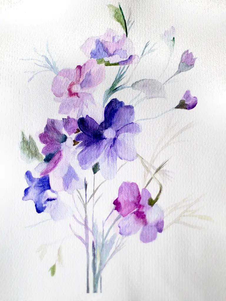
The first of this series of four small paintings presents a delicate bouquet of violet and purple flowers, captured with the precision of the pen and the ethereal softness of watercolour. There is no explicit background, no vase or landscape: just the flowers, floating on the paper, as if they have just been remembered rather than gathered.
The pen defines the contours lightly, almost trembling, leaving space for the watercolour to unfold freely. The purple tones blend together in subtle shades, from a pale lavender to a deep, almost nocturnal violet. A few spots of colour escape the lines, overflowing, as if the flowers could not contain their own life.
This small painting does not seek botanical realism, but atmosphere. It is a flower that speaks more of sensation than of species, more of memory than of form. There is something intimate, contained in it, like a thought that blooms in silence.
It is the first of four pieces which, together, make up a fragmented garden: not a perfect garden, but one made of instants, of fleeting glances, of beauty found almost by chance.
Study of pastel lemons
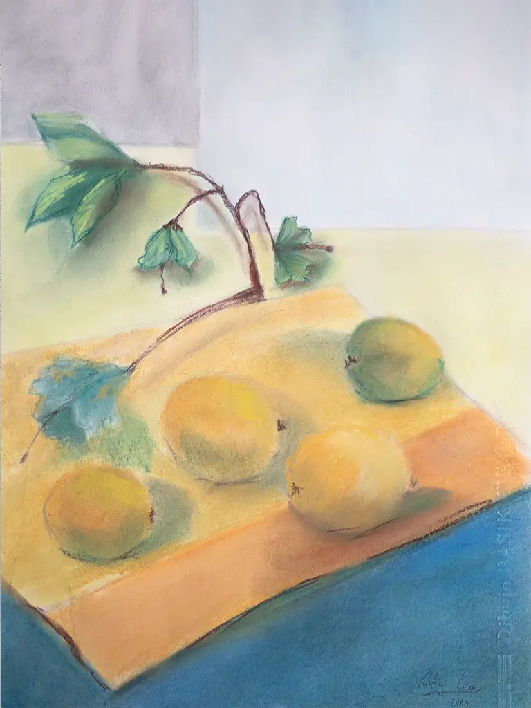
This pastel still life of lemons is a vibrant, tactile study of light caught in the everyday. The lemons, deep yellow almost amber in their sunniest areas, rest on a crumpled white cloth, with soft shadows melting into shades of lavender, ochre and olive green. The background is diffuse, barely suggested with warm tones and broad brushstrokes, making the fruits seem to float within an atmosphere suspended between realism and evocation.
The process was deeply physical. Working with pastels demanded direct, almost intimate contact with the paper. Each layer of colour was applied with the fingers, blurring the pigments to mimic the slightly porous texture of lemon peel. The artist experimented with overlapping colours – mixing canary yellow with soft greens and oranges – to suggest the hues that light cast on the rough surface. The composition developed organically, without sketching, allowing the objects to ‘appear’ as the hand felt them.
The inspiration behind the work was the desire to celebrate the commonplace. Not as something vulgar, but as something profoundly beautiful in its honesty. The lemons, bought from a street stall one spring afternoon, had small imperfections: spots, indentations, scars. Instead of hiding them, the artist exalted them. For there – in what is neither symmetrical nor polished – lies what is truly human. The use of pastel was not accidental: its chromatic richness and malleability were ideal for capturing not only the colour, but also the soul of these lemons, which seem to glow from within, as if they contained light.
Study of lemons in charcoal
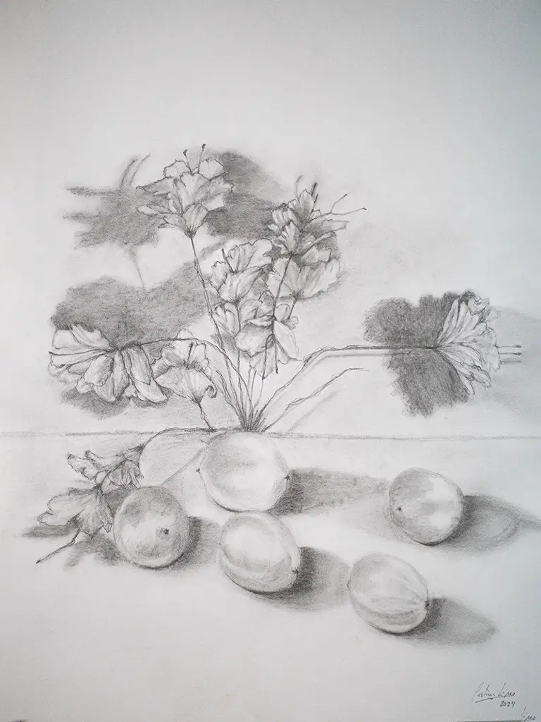
This study of lemons in charcoal captures with sober intensity the stillness and complexity of the everyday. The painting presents three lemons arranged on a rough surface, probably wood, where the texture is insinuated with dense, dark strokes. There is no colour, only shadows. The absence of vibrant yellow forces the viewer to look beyond the obvious: to observe the wrinkles in the skin, the subtle weight of each fruit, the way the light hits the outline and dissolves into the background, almost as if the lemons were emerging from a silent penumbra.
The process of creation was entirely analogue: it began with prolonged observation in natural afternoon light, in a small studio with west-facing windows. The lemons were placed unpretentiously, without any studied composition, simply as they had been left after purchase at the market. What began as a technical exercise in chiaroscuro became a graphic meditation on time and imperfection.
Inspiration was born out of a need to pause. The artist, overwhelmed by the constant rhythm of digital colour and the immediacy of modernity, sought refuge in the elemental: paper, charcoal and fruit. There is something in lemons that refers to the ephemeral – their aroma, their acidity, their ripening process – and that transience is contrasted here with the permanence of the graphite on the paper. In each stroke we perceive the intention of capturing not only a form, but a sensation: the light weight of the simple that nevertheless persists in the visual memory.